Share this
by Claudette Albers-Reid on May 19, 2022
What types of project charts are you and your team using? Project charts are arguably the most helpful visual tools in the manager/owner toolbox to help plan and execute projects.
Certain project charts are better in certain scenarios, and different varieties will appeal to people in different industries.
Here are what we consider to be the top 4 project charts in the project management sphere. Check out what they do, how to use them, and the pros and cons of each.

Why use project charts?
Project charts offer functional value to help you budget, plan, and track your projects. Project charts also serve as powerful visual tools, able to convey mountains of information in a clean, organized way. With just a glance, project charts provide insights like:
- What are the tasks required to complete a project?
- Who is responsible for what?
- How much time will the project take?
- Is the project on time?
- Is the project stuck?
On a practical level, a project chart will:
- Take complex information
- Condense it
- Organize it
- Make it understandable with visual graphics
While project charts provide succinct information for managers and owners, they’re also effective to help stakeholders and resources plan their time. A project chart can ensure that everyone that’s involved in the project is on the same page as to the scope, deadlines, dependencies, and status. You’ll use certain project charts, like Gantt charts, in the project planning stages, while others like Kanban boards will serve their purpose until the project is complete.
What are the best project charts for project management?
Though the term ‘project chart’ is sometimes used interchangeably for a Gantt chart, there are actually more than a dozen examples of project charts. But when you take a look at all the options, it’s clear that some are much more narrowly focused. Others are a bit old-school in the way that they function, i.e. they don’t necessarily pull that much relevant data into project management as a whole.
To weed out the best ones, we made this list for the top project charts based on a few factors. For one, a project chart should be relatively straightforward and easy to use. We also think that the most robust project charts should apply to a wide net of industries. This can be garnered from the overall popularity of the project chart and the specific types of businesses we know use them. And finally, they should serve as tools that inform and improve project management, specifically.
4 Project Charts That Rock for Project Management
Gantt Chart
Who uses Gantt charts? Architecture, Content Planning, Creative, Marketing, Construction, Software Development, and more
Pros:
- Break down all the tasks needed for projects
- See whole project from start to finish
- Track project status
- Clearly check all deadlines, tasks, and stakeholders at a glance
- Dependencies and milestones
- Milestones can easily be inputted
- Relatively easy to create
Cons:
- Not necessary for straight-forward projects with limited stakeholders
- Too granular for simpler projects
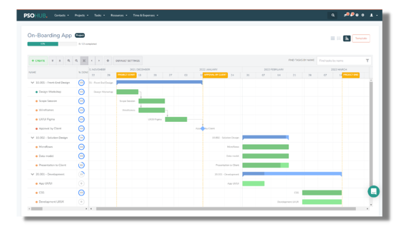
The Gantt chart ranks supreme as the #1 project chart to help plan and execute projects. A Gantt Chart breaks down complex tasks and dependencies into an organized format that’s displayed against time. With a Gantt chart, you can plan, budget, and execute your projects effectively, all while keeping your project’s status in your mind’s forefront. It has a simple structure, like a more nuanced, horizontal bar graph. At a glance, a Gantt chart can give you a good peak into the health of your projects. With dependencies and milestones, you can also clearly see how to move forward when a project gets stuck or a client needs to make a payment.
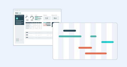
Project Management Software with Gantt Charts: PSOhub, Asana, Monday.com, GanttPRO, Wrike, Smartsheet, Airtable

How to Use:
- Review scope and budget of project.
- Create your tasks.
- Arrange your tasks in a sequence. This is the timeline of the tasks: project execution from start to finish. Be sure to input dependencies and milestones. Now you can clearly see the relationships between each of the tasks.
- Line up your resources and assign corresponding tasks. An integrated resource management tool can make this quicker.
- Estimate task durations and input.
- Review your schedule.
- Check Gantt chart for updates (if you are using integrated Gantt chart software).
More info: Here’s a short video that can quickly let you in on everything you need to get started working with Gantt charts.
Bottom Line- Gantt charts have been around for over 100 years for a reason, and professional services still love them to this day. For developers and certain creatives, they’re a non-negotiable way to plan projects. As for simple projects that don’t require complex, interdependent tasks or tons of stakeholders, Gantt charts may not be necessary.
Kanban Board
Who uses Kanban boards? Literally anyone who does any task management whatsoever.
Project Management Software with Kanban Boards: Asana, PSOhub, Monday.com, Wrike, Airtable, Trello, and many more
Pros:
- Super easy to use and intuitive
- They can create themselves from task lists
- Mainstay of agile project management
- Clearly see who is responsible for what
- Set deadlines, assign tasks
- Share applicable files
- Keeps all task-related information in one area
Cons:
- Can get too busy
- Not as easy to perceive relationships between tasks (as with Gantt chart)
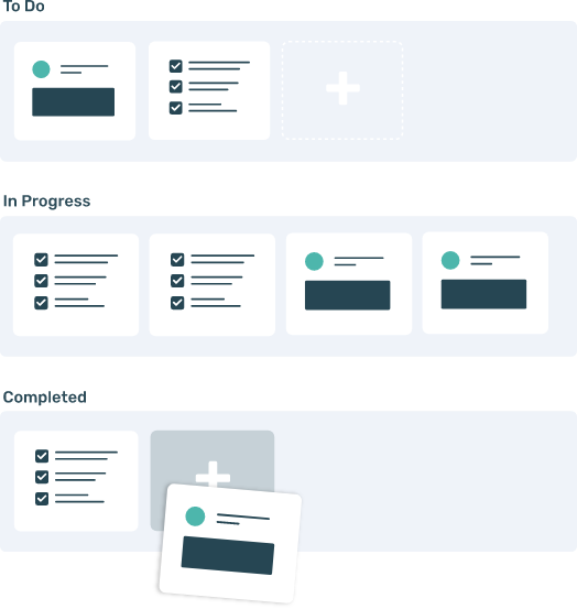
The Kanban board is the friendly, easy-to-use project chart that countless teams cannot go without. These intelligent, often-colorful layouts clearly show the pipeline of work and who is responsible for accomplishing what. Perhaps the best part about Kanban boards is they can create themselves from task lists. That means you can simply assign the responsible parties their tasks, input due dates, add any phases/contingencies, and voila! You’ve got yourself a Kanban board. Kanban boards are provided by software, meaning they are intelligent and will automatically update. You can easily see the progress of your tasks and the status of the project at a glance. Kanban boards work in both a vertical and a horizontal layout, too; so you can choose whichever your brain prefers.
How to Use:
- Make a task list for your project.
- Label your columns as the different phases your tasks must pass through before completion.
- Assign your tasks and include due dates, plus any other relevant information like supporting documents, instructions, etc.
- Enter your dependencies (if any).
- As tasks get completed, they will move across the board.
More Info: The old-school way to create a Kanban board is with sticky notes across a blackboard or dry-erase board. Now, many project management solutions offer task management with built-in Kanban boards that can be created in seconds from a task list.
Bottom Line- Kanban boards are easy and friendly, a tried-and-true favorite of the agile project management methodology. Most task management solutions come with Kanban boards included in the software, as they are insanely popular.

Flowchart
Who uses flowcharts? Flowcharts are applicable in nearly every industry.
Project management software with flowcharts: Bitrix24, ConceptDraw PROJECT, Lucidchart
Pros:
- Very easy to make and understand
- Strong visual for presentations and meetings
- Clear processed outlined
- See the flow of your project from start to finish
- Great for simplifying complex workflows
Cons:
- May lack detail and functionality for complex projects
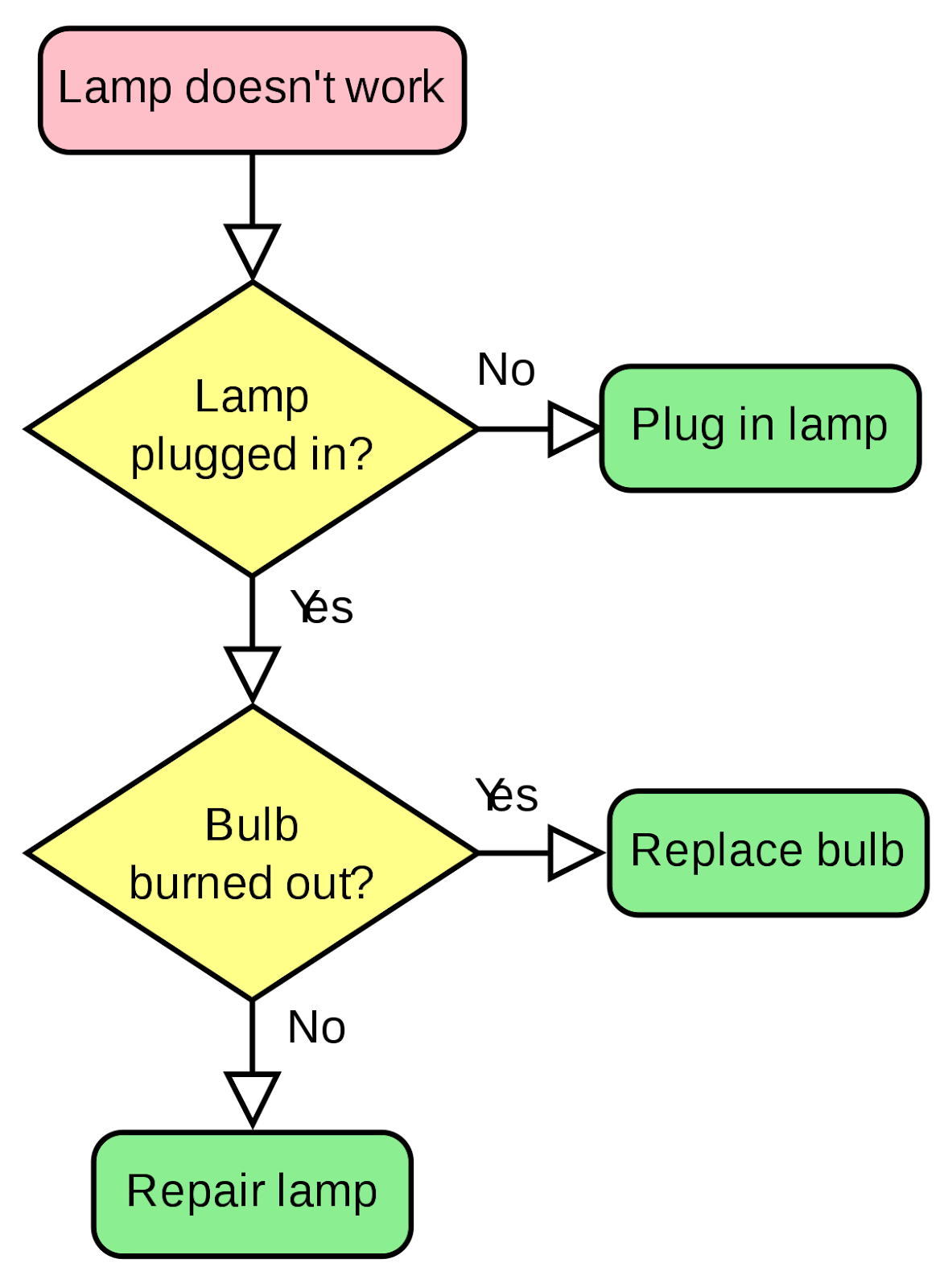
Image by Wikipedia
Flowcharts are just what they sound like– they display how the project flows from start to finish. A flowchart clearly shows the progression of a project with shapes and colors, along with lines or arrows that show the direction of the ‘flow’. Flowcharts are fantastic when you need to condense multiple stages of work into one, easy-to-grasp visual. Ipso facto, they’re a great asset for meetings with stakeholders and clients. The best time to make a flowchart is during the project planning stage, before you assign tasks. Since the flowchart is not granular, it doesn’t have the capability to manage daily project tasks. Think of the flowchart as more of a high-level graphic that can help people understand the project process as a whole.
How to use
- There’s not as many rules when it comes to creating a flowchart. To start, identify the necessary tasks to complete your project.
- Arrange these in different shapes, depending on which format you choose. Use arrows or lines to move progress either from left to right or up-down, beginning with the first step/initial tasks and ending with project completion.
- Don’t get too detailed with your tasks on the chart itself. Flowcharts are more of a high-level view to help everyone see how the project flows from start to finish.
Bottom Line- The flowchart is an asset for the initial planning stages of a project and/or as a presentation material for stakeholders and clients. However, a traditional flow chart does not provide enough functionality for day-to-day managing of project tasks.
PERT Chart
Who uses PERT charts? Web developers, IT firms, marketing firms, scientists, fit-out agencies
Project Management Software with PERT charts: Wrike, Lucidchart
Pros:
- Very clean, cut-and-dry
- Easily view important details of your project schedule
- Calculate overall time it will take to complete project accurately
- See how much slack time your team has
- Parallel tasks and dependencies
- Good for tracking tasks with unknown/arbitrary timelines
Cons:
- Tedious to update
- Not very user-friendly; difficult for team members to interpret
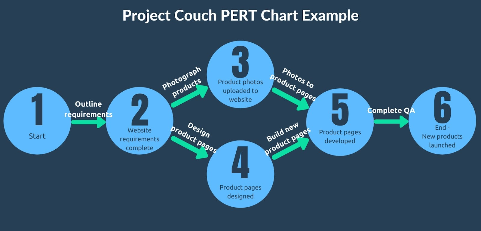
Image by Hubstaff
PERT charts may look old school, but they are still a highly popular project chart in the digital age. PERT stands for Program Evaluation and Review Technique– this is a system that uses circles or boxes with lines or arrows to chart activities across time. A PERT chart is a diagram that uses the PERT technique to map out the tasks and milestones of a project. A PERT chart also dictates the overall schedule of the project, complete with task dependencies and assigned stakeholders. This means that theoretically, managers and owners can see everything that’s pertinent to their project schedule in one place. In a PERT chart, each circle or box represents a task. Within each circle/shape are multiple sections that include information about a task that can be represented numerically; most of these values are related to task duration. When you calculate the numbers in a PERT chart, you can see how long the project is expected to take, what lies on the critical path, the slack time of each task, and which tasks should be prioritized.
How to Use:
- Review scope of project.
- Make a task list with any necessary dependencies taken into account.
- Create a table with 6 columns using Excel or other software. Here’s what should go in each field:
1- Task name
2- Predecessor aka what task needs to happen before 1 can begin
3- Task duration: best-case scenario
4- Average estimate of task duration
5- Task duration: worst-case scenario
6- Expected
- Enter the best-case, average, and worst-case time durations for each task.
- Calculate the expected durations of each task:
(Best-case + (4 x average) + worst case) / 6
- Fill out a PERT chart from left to right with this info, including the durations of each task.
- The first task that starts off the project has Early Start (ES) value of 0. Early Finish (EF) = ES + duration
- The ES of the subsequent task = EF of predecessor. From left to right, enter ES and EF for every task. When a circle or box has 2+ predecessors linked to it, the ES will equal the last EF connected to the task.
- When you arrive at the final task, the EF will will become the LF (Late Finish) aka the absolute longest you want your project to take to complete.
- From here, work backwards from right to left to figure out each task’s LF and LS (Late Start). Start at the last LF you calculated in Step 9. Subtract the duration to get the preceding task’s LS. This LS value will then be input as the LF of the task preceding it (remember, you’re working right to left now).
- Calculate your slack time for each task with this formula: Slack = LF - EF
- Identify the critical path. Any tasks that have a Slack value of 0 should be highlighted on your PERT chart and prioritized in your project planning.
Bottom Line- PERT charts can be highly effective at calculating how long a project will take, but they’re not as visually powerful or user-friendly as Gantt charts and Kanban boards.
Other Project Charts
Some older-school project charts still provide value for project management, but they’re not nearly as popular and versatile as the 4 listed above. Here are a few of the more outlier project charts still being used today:
WBS Chart - WBS stands for Work Breakdown Structure. Accordingly, the WBS Chart will break down workloads into levels with corresponding tasks and stakeholders easily visible. WBS charts don’t allow for task dependencies, making them inefficient for certain projects.
Bar Graph - Old-fashioned bar graphs still do the trick to convey important information in the project lifecycle. Bar graphs are easy to make, and everyone understands them. However, you will be limited from a complexity standpoint.
Pareto Chart - The Pareto chart combines the bar graph with the line graph. Though myopic, Pareto charts are extremely easy to create and interpret.
Cause and Effect - Cause and effect charts are used to anticipate problems that may arise throughout the project lifecycle before they occur. All the possible causes and effects are mapped out, so managers can rely on premeditated solutions.
Which project chart(s) should you use?
The type of project chart you should use will depend on the nuances of the project itself as well as your personal preference. For more of a high-level overview, planning visual, a flowchart is easy to make. As far as easy task management goes, you can’t go wrong with the ever-popular Kanban board. Gantt charts take it up a notch for more complicated projects, whereas a PERT chart homes in on exactly how long a project will take. And finally, you can use one of the other project charts for more targeted presentations within the project lifecycle.

Share this